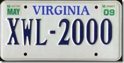
When I think of Virginia I initially think of Jamestown and our nation’s founding. Then I think of Lucille McGillicuddy. Then I think of this image and how Virginia’s tourism department is trying to lure us into visiting their state by telling me that this place is ‘for lovers’.
Huh? I don’t really think of Virginia as a state for ‘lovers’. But I do love Katie Couric, an alum of University of Virginia. So there’s that…
A little underwhelming given then whole ‘lovers’ aspect I just discussed and my first impression is that it is very, very, very plain. But to me, that says ‘Virginia’. I don’t know a whole lot about this state other than it’s called the ‘Mother of Presidents’ because four of the first five presidents came from Virginia. It is also called ‘Old Dominion’ because King Charles II of England deemed the settlers of Virginia to be the ‘best of his distant children’. Thus, Virginia was raised to the position of dominion along with England, Scotland, Ireland, and France.
I would think this status would give the people o Virginia a big head. Clearly that hasn’t translated to today because I don’t know anyone who brags about being from Virginia. In fact, I don’t even know anyone from Virginia, I don’t think.
This plate has one thing going for it: the font for ‘Virginia’. I like the way the ‘A’ is thicker on the right side and how that effect generally carries over to the rest of the letters. It seems very ‘Old World’/‘Colonial’ to me, which fits with it’s history.
I like the dark blue almost black coloring of the plate numbers and letters. It stands out from the white background. But the white background is just…so…boring. Why not put a ship sailing across the ocean or landing on a beach in Virginia. That would’ve been a plate. Not this. This is a C-.

